2009-03-28

Stellar Data

A week or so ago I slipped out a file format page, adapting Marc Miller's article in Challenge #26 describing the first standard sector data file format. It's pretty bare bones at the moment - just what's in the article so it is preserved for posterity - but I plan to grow this over time to document other sector data file formats that have appeared over the years. Call this "Version 1.0".

(Honestly, posting it was inspired by site users wondering what the various base codes in the data meant. But everyone seems to love file format discussions...)

Then, inspired by Yet Another Thread on sector data file formats on CotI I decided to finally tackle stellar data.

  • Stellar data now output by SEC.aspx API when present in source data. The following grammar is used:

// Basic:
// system ::= star ( w+ star )*
//
// Extended: (Malenfant's Revised Stellar Generation Rules)
//
// system ::= unit ( w+ companion )*
// companion ::= near | far
// near ::= unit
// far ::= "[" system "]"
// unit ::= star | pair
// pair ::= "(" star w+ star ")"
//
// star ::= type tenths w* size main?
// | dwarf
// | unknown
// type ::= "O" | "B" | "A" | "F" | "G" | "K" | "M"
// tenths ::= "0" | "1" | "2" | "3" | "4" | "5" | "6" | "7" | "8" | "9"
// size ::= "D" | "Ia" | "Ib" | "II" | "III" | "IV" | "V" | "VI" | "VII"
// dwarf ::= "DB" | "DA" | "DF" | "DG" | "DK" | "DM" | "D"
// unknown ::= "Un"
//
// main ::= "*"
//
// w ::= " "


  • "Un" in stellar data is from Mendan 0221 in Challenge #46 (by Mike Mikesh). That could be a typo, but I'm interpreting it as "Unknown" (mysteries abound!). Note that the world is an Amber zone, so it's a navigational hazard at least!
  • Like other SEC.aspx output, the data is normalized - that is, it's been parsed and then re-output. In some cases this may filter the data. You get what you pay for. In particular, although Malenfant's revised stellar generation data is now consumed by my site, only basic star data is output. Anyone have a link to Malenfant's rules?
  • SEC.aspx output now has a sector header, similar to the GEnie data. The field lengths are NOT guaranteed to remain fixed, however. Consumers that rely on fixed width fields (rather than Regular Expression or Grammar-based parsers) should parse this header to determine the field lengths.

1-25: Name
27-30: HexNbr
32-40: UWP
42: Bases
44-68: Codes & Comments
70: Zone
72-74: PBG
76-77: Allegiance
79-98: Stellar Data


  • I tidied up some bogus stellar data: Night (Core 0839) "K8 VI M4" to "K8 VI M4 D" (presumably a truncation); and Tender Mercy (Ley 0314) "2 V A6 D" to "K2 D M6 D" (ditto); in both cases I used older GEnie data as the source
  • While I was there, I fixed a couple of O/0 (oh/zero) typos: Kaskar (Vland 1933) stellar "MO V K6 D" to "M0 V K6 D", and Zdienjbats (Far Frontiers 1801) PBG "BO4" to "B04". The latter actually inhibited the world from showing up on the map - oops!
That's it for now! Ω

2009-03-19

Two Cool Maps

Two non-traditional renderings of some of our favorite subjects.

First up, a Traveller subsector, created and illustrated by Merxiless over on CotI:

http://www.travellerrpg.com/CotI/Discuss/showthread.php?t=18839

Second, the Milky Way... in logical "subway map" form:

http://arbesman.net/milkyway/

(When we moved back to San Francisco a few years ago we noted that it the light-rail Muni lines finally had "logical" maps - just like a real grown-up city!) Ω

2009-03-17

Mismatch Resolved (For Now)

I've settled on a solution to the galaxy scale mismatch discussed in the previous post.

I analyzed the Mikesh map and, while the horizontal/vertical parsec ratio is only 0.9, that's closer to the actual ratio than 1.0 which is the ratio of the Linehan map.

So I've decided to keep the Mikesh map as the primary data source. The galactic structure is now scaled to fit it, which means the Galactic Rifts line up. The change is subtle enough to be pretty much unnoticeable unless you zoom in to where the Core Route and the Galactic Rifts line up - then they are off by several sectors. But honestly, these were wonky anyway.

BeRKA suggested dropping some of the Core Route sectors, but they actually have route metadata winding through them. Honestly, I think they're mostly just a "cute" addition to the site and don't take them particularly seriously, but enjoy having them. So I might as well keep them intact.

By the way, the horizontal/vertical parsec ratio is noticable in Classic Traveller material as well. If you compare the shape of the Imperium presented in the Atlas of the Imperium (by, say, photocopying each page and laying it out like a poster... not that I ever did that...) with the shape of the Imperium as presented in the Alien Module maps you'll see that it's "squashed" in AotI. This is because the AotI-style maps use square hexes. The "Atlas"-style rendering on the site uses rectangular hexes. I believe this "squashing" infected the DGP dotmaps as well (in Vilani & Vargr and Solomani & Aslan). Ω

2009-03-15

Galaxy Scale Mismatch

Hrm... my two sources of data for the Traveller galaxy structure don't quite equate, leading to fairly dramatic mismatches.

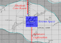
If you measure the Local Arm's girth at the Ray 0 i.e. through Reference (Core 0140) on the detailed map from Security Leak by Mike Mikesh, you get a distance of 1600 parsecs. If you measure the distance on the detailed map by Clifford Linehan - which he used to construct the Zhodani Core Route - you get a distance of 1760 parsecs.

Composite of the two maps.

That's about a 10% difference... and it's going to bother me. I dug a bit further and it looks like the Security Leak #5 map is the original source, per this conversation between Marc Miller and Clifford Linehan. Mr. Linehan took Mike Mikesh's original, scanned it, cleaned it up, and handed the results back to MWM who took it under the FFE fold. This would indicate that either Mr. Linehan corrected the size (to fit known dimensions of the galaxy) or accidentally scaled it up. (Charted Space doesn't quite line up either.)

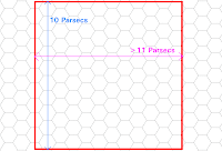
Since Traveller parsecs are based on a hexagonal grid, it's actually easy to introduce an error of around 14% - hexes pack more tightly horizontally than vertically, with a ratio around 0.868. This is factored in when I map from image-space to world-space (and you'll see residue in the API). Here's a sample - the red square is precisely 10 parsecs tall, but more than 11 parsecs wide - yet it's a perfect square if you count the pixels.


If I had to guess, I'd say that one of the two galactic-scale map authors was unaware of this, and and used a horizontally-biased parsec scale for determining the number of sectors between Charted Space and the galactic core.

Bleah. :( Ω

2009-03-14

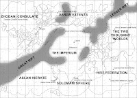
That article on rifts from Security Leak fanzine was too good to pass up, so I've incorporated Mike Mikesh's speculation on the extent of the local rifts. Check it out:


Rift rendering using vectors has been dropped, and it now relies on a bitmap - this gives softer edges which IMHO is an improvement. If you zoom out the rifts gradually fade as they become insignificant relative to the overall Galactic structure. If you zoom in they fade in, then disappear at the same point where the map stops rendering "background" stars - now at 4 pixels/parsec. In between they're quite pretty - and look somewhat like an absorption (or "dark") nebula.

The effect is present but not particularly visible in non-Candy styles as well, most notably now as dark shading in the "Atlas" style which mimics (crudely) the shading of the rifts shown in the Alien Module maps. The edges of the rifts are a bit coarse, and I'll probably tweak them over time.


As always, comments appreciated. Ω

Far Out, Man!

Start at Reference in "Candy" style - and then zoom out. A lot.

Go ahead, I'll wait for you.

Nifty, huh?

Okay, if you're lazy, here's the image:


Well, I think it's nice, at any rate. This is inspired by the latest renderings of the real Milky Way galaxy, such as the one over at the Atlas of the Universe:


(Milky Way image © Richard Powell, c/o Atlas of the Universe.)

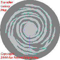
However, the TravellerMap site is a map of the Traveller galaxy, not the real Milky Way, so I had to pull out the image editor and build it from scratch. This is based on the Traveller galaxy map first introduced to the site back in 2005, courtesy of Clifford Linehan from his (now defunct?) Zhodani Core Route site, sourced by Marc Miller:


(Traveller Galaxy image © Far Future Enterprises, c/o Clifford Linehan)

There are definite differences between the real and fictional galaxy. For example, in the real Milky Way, Earth's sun is part of the Orion Arm, which is mere spur off of the Perseus Arm, next to the Sagittarius Arm. In the Traveller galaxy, Terra appears to be in the main body of a major arm. The real Milky Way is a distinctive barred spiral, whereas the Traveller galaxy is not notably barred (although I rendered a subtle bar in anyway). In a real galaxy, there are nearly as many stars in the rifts between arms as there are in the arms themselves - the arms are slowly propagating gas density waves that induce more star formation, so they are full of bright young stars. In the Traveller galaxy, the rifts have much lower density, which makes things trickier for the Zhodani core expeditions. I don't have a problem with this difference - after all, space in Traveller is 2D. I view this as a perfectly acceptable simplification for the game universe, and don't attempt to fit it to reality. To me, it's a lot like chess. Real battles between opposing armies rarely take place on a perfectly flat 8x8 grid, but that doesn't mean chess isn't a fun game that teaches real strategy.

To create the image I took the galaxy map (isolated to a white-on-black mask), the pseudorandom stars from the map site, Paint.NET and experimented with various layers, blurs, and mixing functions. The cloudy arms were created by blurring the map, rendering in clouds, then using a twist filter. This had various densities of galactic structure and stars layered on top. The core was generated with several overlapping gradients to get an overall white glow, the rosy core, and the bright bar.

If you zoom in, the "Galaxy" image will gradually fade to the "Nebula" background used for candy-style rendering (c/o Wayne Peters). The only really grody bit is that the local rifts fade in as well, and they have abrupt edges. I'm pondering what to do there. Classic Library Data states:

Situated in the center of the Imperium, Capital's astrographic location has proven of prime importance, as it controls the only gap in the Rifts for thousands of parsecs. Besides being a communications hub, Capital is a cultural center, and educational focus. - Adventure 3: Twilight's Peak (emphasis mine)
The emphasized portion is not present in Supplement 8: Library Data (A-M) and later updates of the Library Data for Capital, possibly because the Traveller universe was more refined. However, looked at on the scale of hundreds of parsecs, it is true that the Imperium - centered on Capital, does control the only large gap in the rifts... if the Great Rift and Lesser Rift are presumed to continue on for a thousand parsecs in each direction.

w00t! Google just found me an issue of Security Leak Magazine where Mike Mikesh analyzes the local rifts in the context of the overall Traveller galaxy - sweet! Well, I guess I know what I have to do next...

(EDIT 2015-10-17 - restored the galaxy bitmap to the one in use circa 2009; the blog post contained a link to the live resource which was replaced so the post had become nonsensical.)
Ω